CASE STUDY — 2018
Mental Health Therapy with Relish
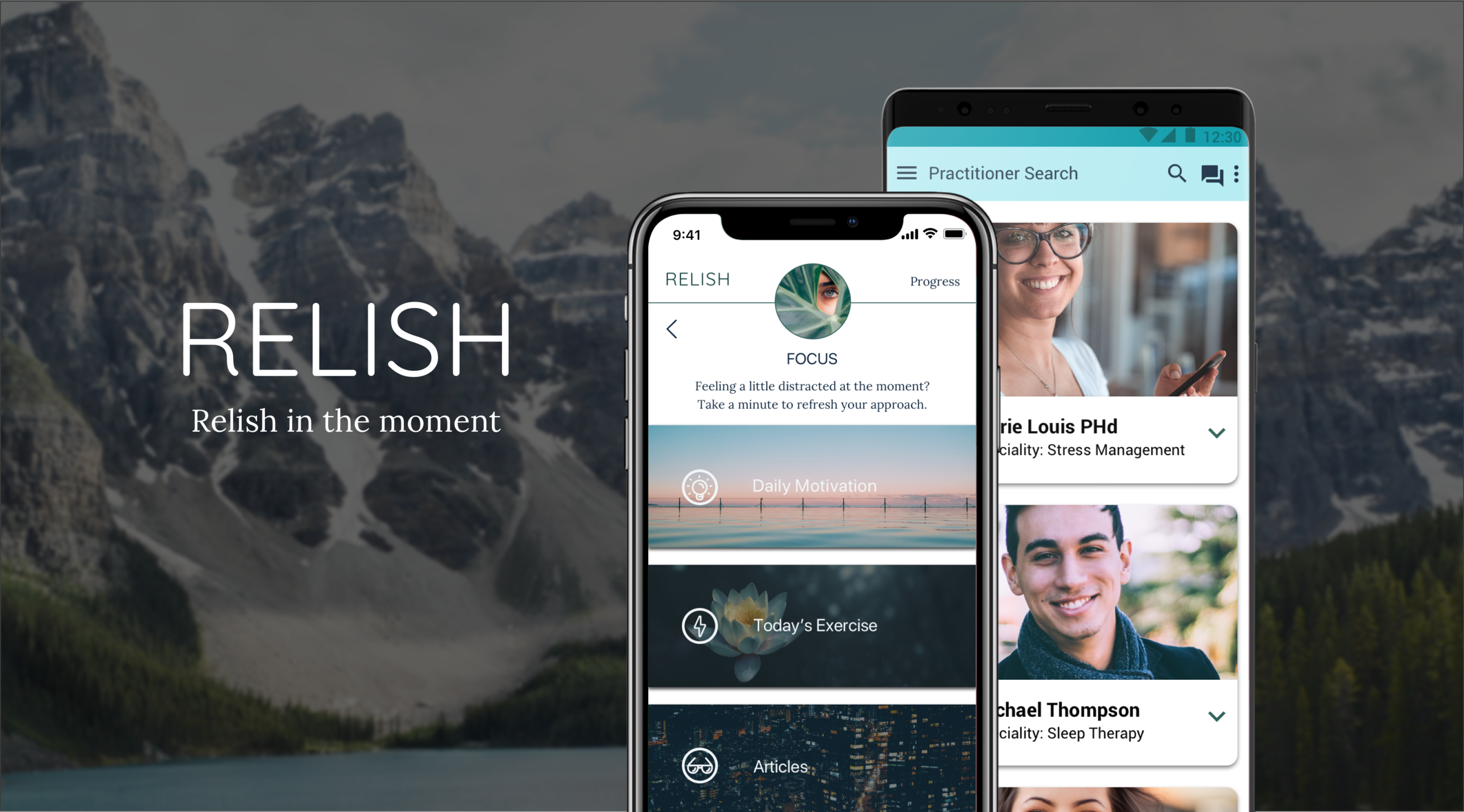
Mental health had been ignored in the workplace as a contributing factor to a person’s performance and is often not seen as a disability. The Relish native mobile app aims to help people develop, recognize, and combat stress and mental fatigue through mindfulness practices, meditation, one-on-one counseling, and community engagement, which help users be more present and self-compassionate.
MY ROLE
UX/UI Designer: User research, design (for iOS/Android native experiences), and testing.
TEAM
This project was a design concept used to practice native mobile app design and a personal initiative to create a product filling the gap between finding and communicating with certified mental therapists and engaging with others to create healthy mental habits from the lessons provided within the app.
HYPOTHESIS
There is a need to increase the accessibility of mental health resources, and that designing a mobile app, would fill this need through technology that people already have, which could benefit those who might not be comfortable leaving the house in their current mental state.
RESEARCH
Due to time constraints for this project, research was gathered through my personal experience with mobile apps including, the Calm app, BetterHelp Services, and surveying close friends and relatives in their overall awareness as well as experience with mental health.
The candidates surveyed varied between the ages of 21 - 35 as this demographic indicated their interest and advocacy for mental health awareness and therapy.
The UX Design with Wireframes & Mockups
Relish was designed to have a simple, minimal, and easy-to-navigate user experience. Inspired by the images and words associated with calming experiences the app needed to have as little design noise as possible.
To determine how this could be achieved, a user flow and wireframes were drafted with a strong reliance on visual elements and expandable/collapsible components.
Brand Development
After analyzing other meditation and telehealth apps on the market, I made note of how certain visual elements felt too clinical, and at the opposite end, which elements induced a sense of calm, and how quickly that was achieved after logging in, as well as elements that were confusing. These observations were made to inform the design of the logo, colors, and font selection.
The following design decisions were made to evoke the feeling of ease and relaxation, that would hopefully create a comfortable environment for the user to connect with a therapist or the community.
NATIVE APP DESIGN: IOS
Color Palette

#83C3B2

#2F635B

#030003
#FFDEA7 A:72 #EA6362
Typography: Apple System Typeface: SF Pro Display

High-Fidelity Mockups
NATIVE APP DESIGN: ANDROID
Color Palette

#162B42

#0097A7
#030003

#FFDEA7 A:72 #EA6362
Typography: Roboto

High-Fidelity Mockups
Familiar UI Patterns
Indicators in the app showed users that they would be able to move and interact with the app with controls similar to each native mobile app experience. In iOS a bottom nav bar is design, because this was not a native experience for iOS, while on Android, a bottom nav bar, was already built into the Android system.
Challenge: Which interactions should take the user to a different page versus, appear as a floating modal or full-screen media player?
Goal: Creating a dynamic and engaging experience to create healthy mental habits for users.
Solution: Designing content components according to familiar UI patterns, and including ways to move between different areas of the app to enable exploration and flexibility in helping users find the right activities that were the most effective for them.
To help ensure that a few user flows within the mobile app were easy-to-navigate, a prototype using InVision was created and shared to acquire feedback
Android Feedback
Overall, flow wise it’s good. I was able to figure it out
Clear imagery helps well
Overall looks good. UI can be cleaner and it looks fuzzy to me…maybe cuz images are truncated to smaller resolution
Practitioner Search Screen: It isn’t clear how I can find this page
Resolved: added Practitioner section to menu
Sleep Screen: The toolbar options don’t work on the page
Resolved: added header hotspots
Splash: add more time
Daily Motivation card on main content page - “calming”
Practitioner Details - Move the bio down
Resolved - moved the bio down
Chat
The new chat icon was active
Good layout
iOS Feedback (not in video)
Splash page should last longer
Changed to 4000 ms from 3000 ms
Log in: Nice image choice
Upon entry: Need to know what the app is about
Created an about dialog box
Daily Motivation: nice choice in fonts
Profile screen needs more balance
Realigned, reordered, and edited font size to better fit grid and layout guidelines
Alerts Settings: Nice screen. Has better balance.
Events: I really like the photos you used at the beginning maybe you can incorporate some of the colour from them to the top of your screens to make the branding stick out a bit more and separate from the content
Contrast on the Search page
Community Engagement Requirements for iOS and Android
In-App communications between members and their designated mental health counsellors, helped users understand that they had the support they needed, and did not have to find solutions on their own.
Challenges:
How should navigation differ between iOS and Android?
How can we avoid too much of a disconnect between experiences to reduce design debt and user confusion?
Goals:
Design the app experience according to familiar system patterns
Create reusable components for the main areas of the screen where media, content, and communication features can develop brand trust, muscle memory, and equal access to all products and services to all users.
Solution:
iOS: Communication features and functions were located in the bottom navbar. This allowed users to focus on content rather than confused with how they would navigate the app.
Android: The Material Design Guidelines provided visuals showcasing how components and interactions were grouped. For example, the side menu was available through the hamburger icon on the top navbar, alongside the search and chat functions.
iOS Navigation

Android Navigation
Project Results
User Experience Design
A major challenge that I encountered during the design of Relish, included designing different components, color palettes, and interactions depending on the type of system the app would be designed for.
The initial purpose was to bring awareness to users on the importance of mental health and bridge the gap between professional counseling, content, and community support.
After speaking with survey participants, and based on my own journey towards mental health, I discovered that many felt that more organizations should be aware of how mental health impacts work performance and that this kind of app would be helpful to employees.
This showcases the potential business value of the app because valued employees would have resources available to them to alleviate stressors that would have detracted their work quality; company morale, and general happiness on the job, which could lead to a problem with retention if employees did not feel valued or respected at work.
User Interface Design
Based on my academic, and professional studies in Color Theory, I sourced inspiration from photos referencing nature, tried to keep shapes with rounded corners as much as possible, and kept colors within a green or energetic bold color to either soften or motivate the user.